Timothy Adams Chocolates — Lucky the Pink Bunny & the Birth of a Brand
Every enduring brand begins with a story.
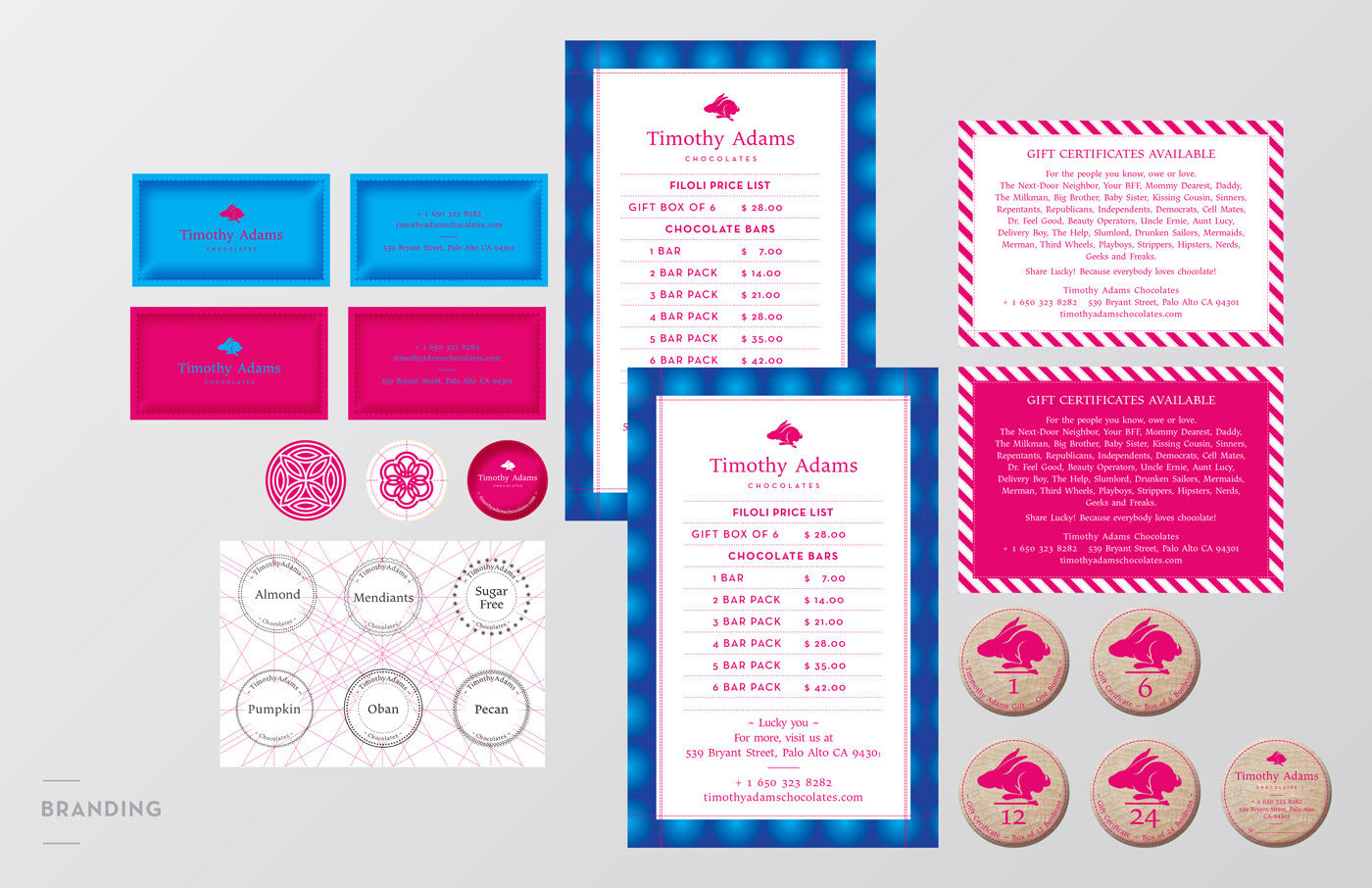
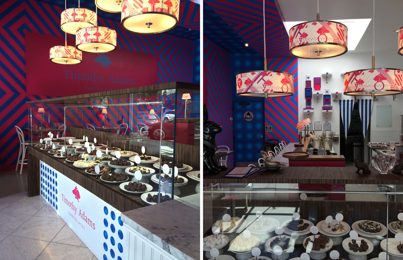
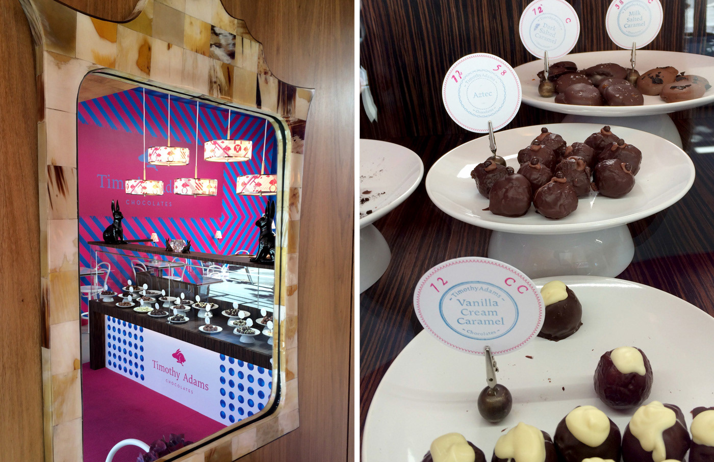
Timothy Adams Chocolates was conceived as a premium artisanal chocolatier rooted in craftsmanship, exceptional ingredients, and the founders' shared passion for fine chocolate. The challenge was to create a distinctive identity that could grow far beyond a logo—establishing a recognizable visual language across the boutique, packaging, products, and customer experience while remaining flexible enough to evolve over time.
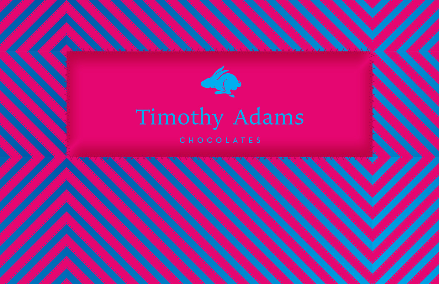
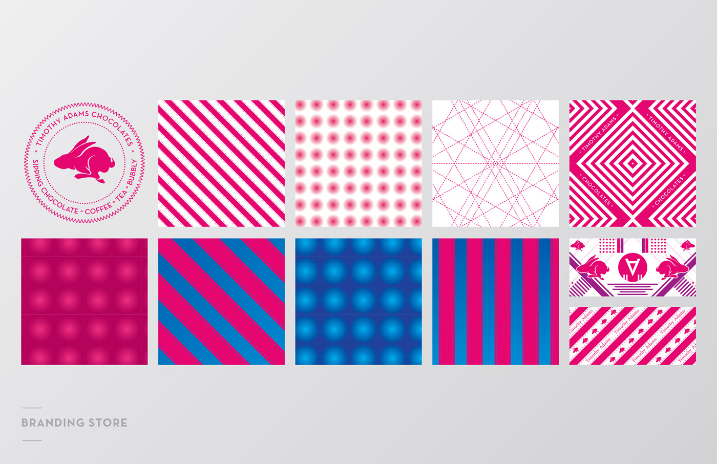
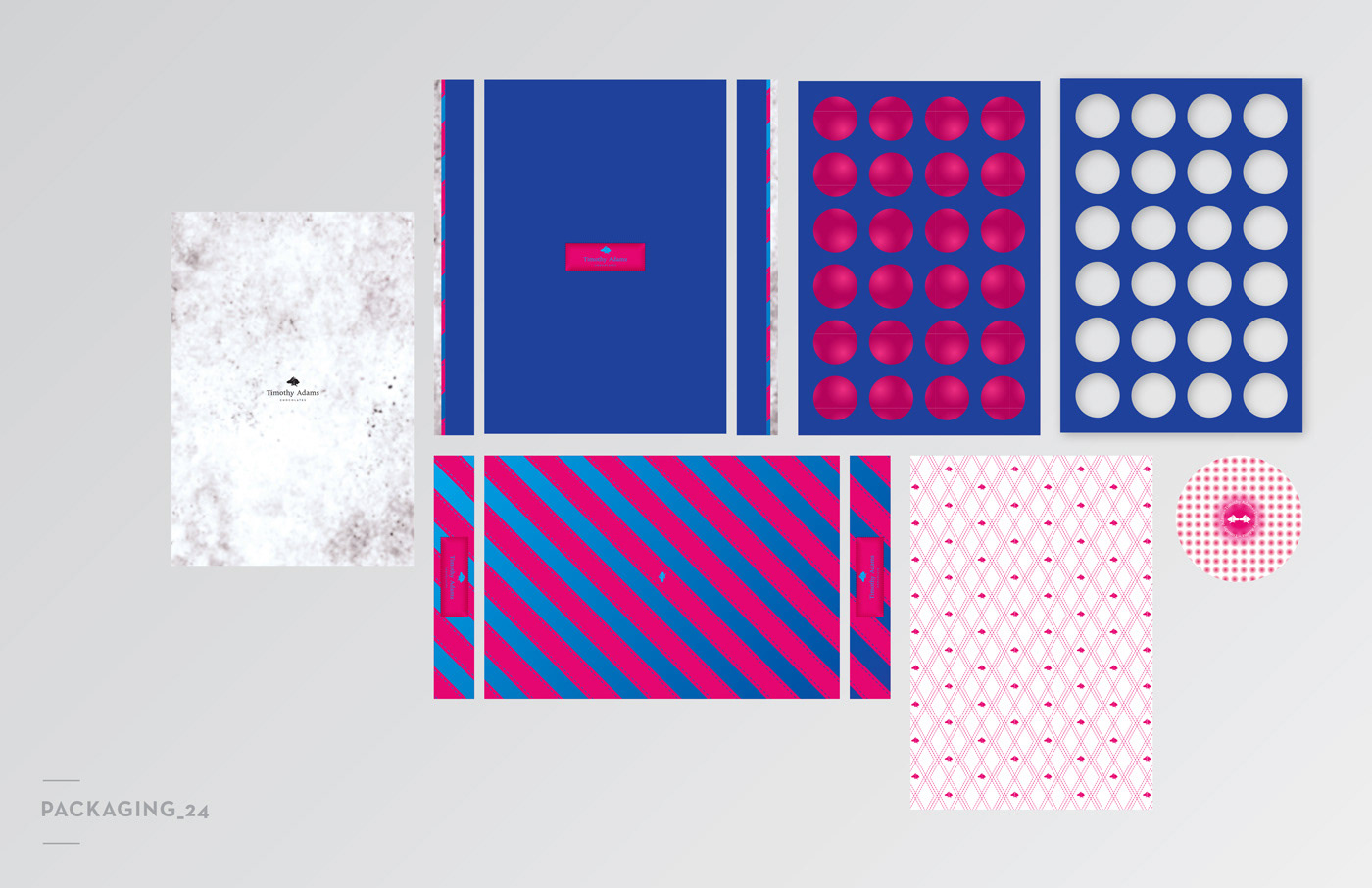
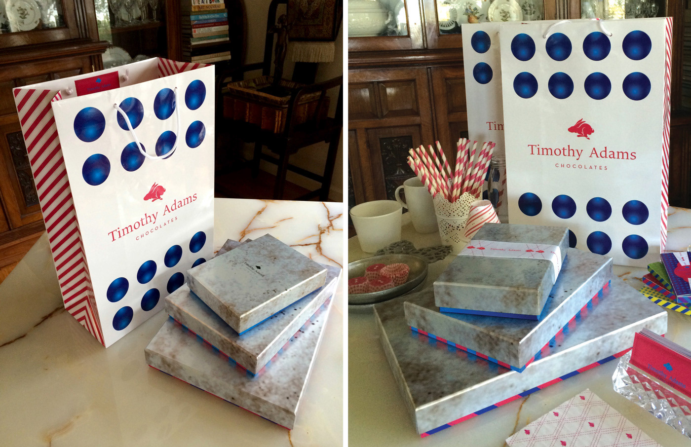
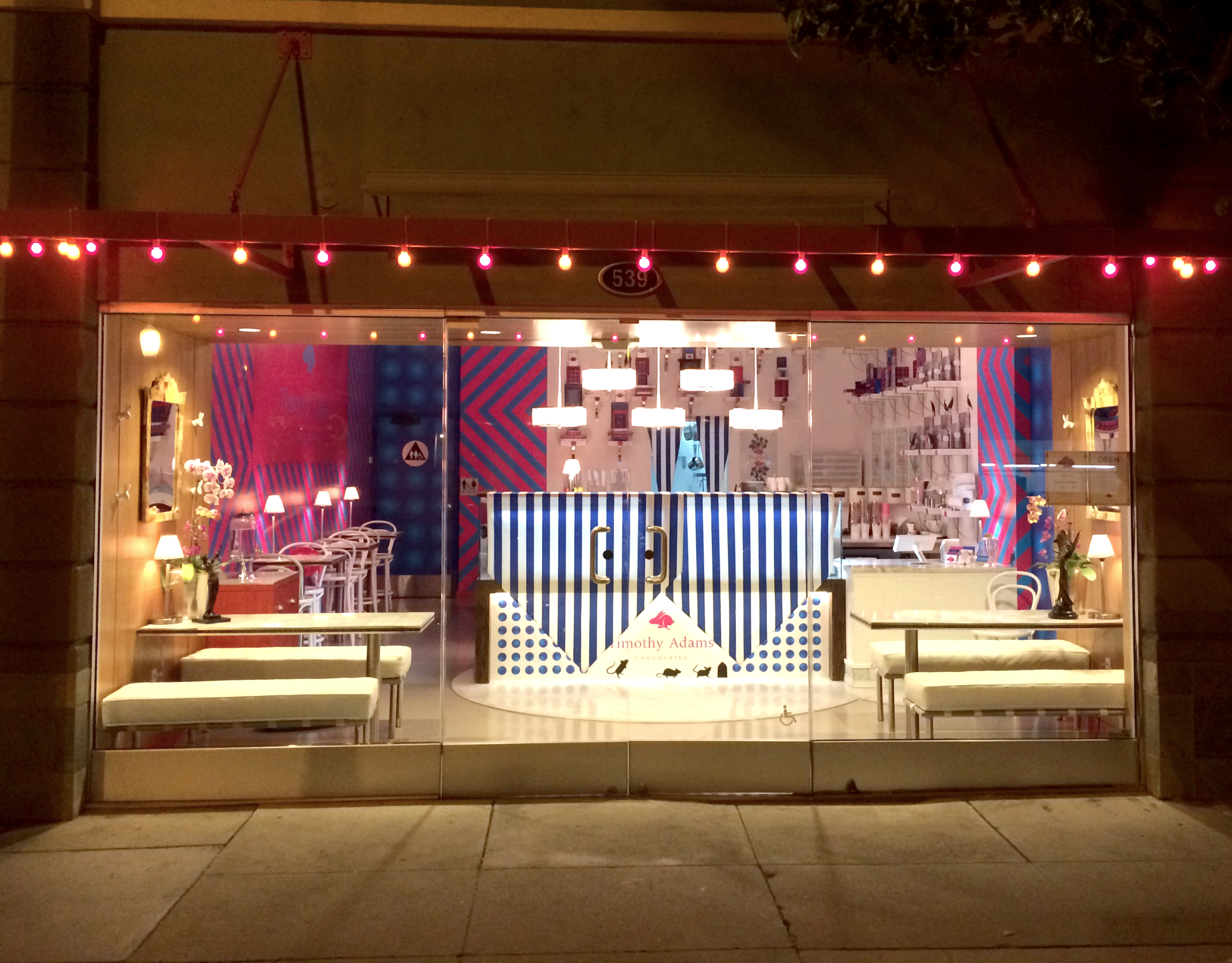
Rather than following the familiar visual clichés of artisanal food brands, the identity introduced a brighter, more contemporary aesthetic. Vibrant colour was balanced with generous white space, while handcrafted textures, stitching, and subtle imperfections referenced the care and craftsmanship behind every product. The result was a visual language that felt warm, optimistic, and unmistakably its own.
At the heart of the identity is Lucky the Pink Bunny—a bold graphic character created not simply as a mascot, but as a recognizable brand ambassador. Symbolic rather than sentimental, playful without becoming overly cute, Lucky became a memorable visual signature capable of adapting naturally across packaging, seasonal collections, retail environments, and brand communications.
Rather than relying on a rigid brand standards manual, the identity was conceived as an evolving visual system. Built on consistent design principles rather than fixed rules, it allowed the brand to grow organically over more than a decade while maintaining continuity, recognizability, and creative flexibility across every customer touchpoint.
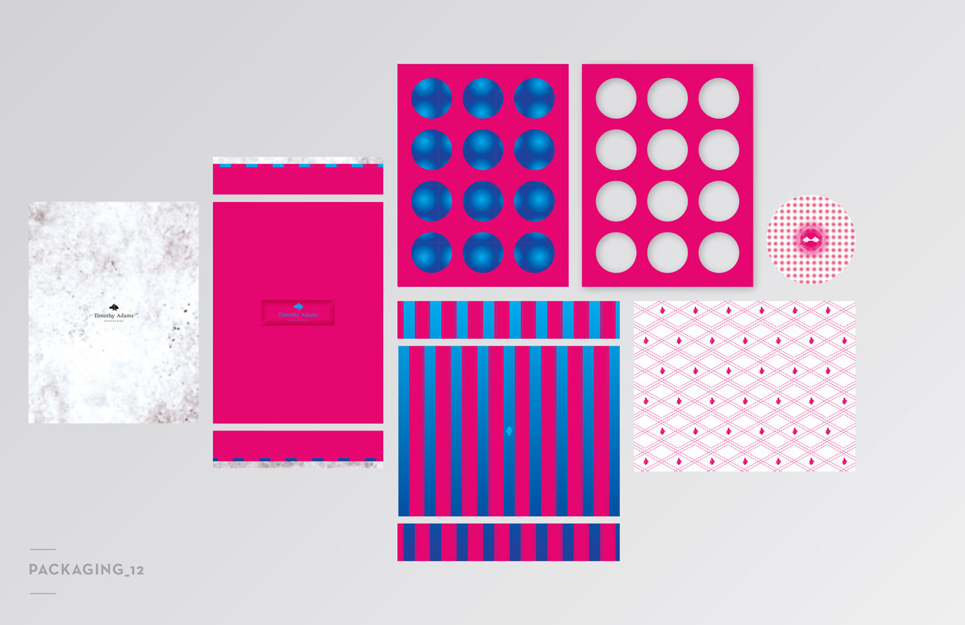
This project established the visual foundation for a twelve-year collaboration that later expanded into packaging systems, chocolate surface graphics, retail environments, seasonal campaigns, and immersive brand experiences.
Creative Direction | Art Direction | Brand Identity | Packaging Design
Lidia Krupka / LK Visual Communications