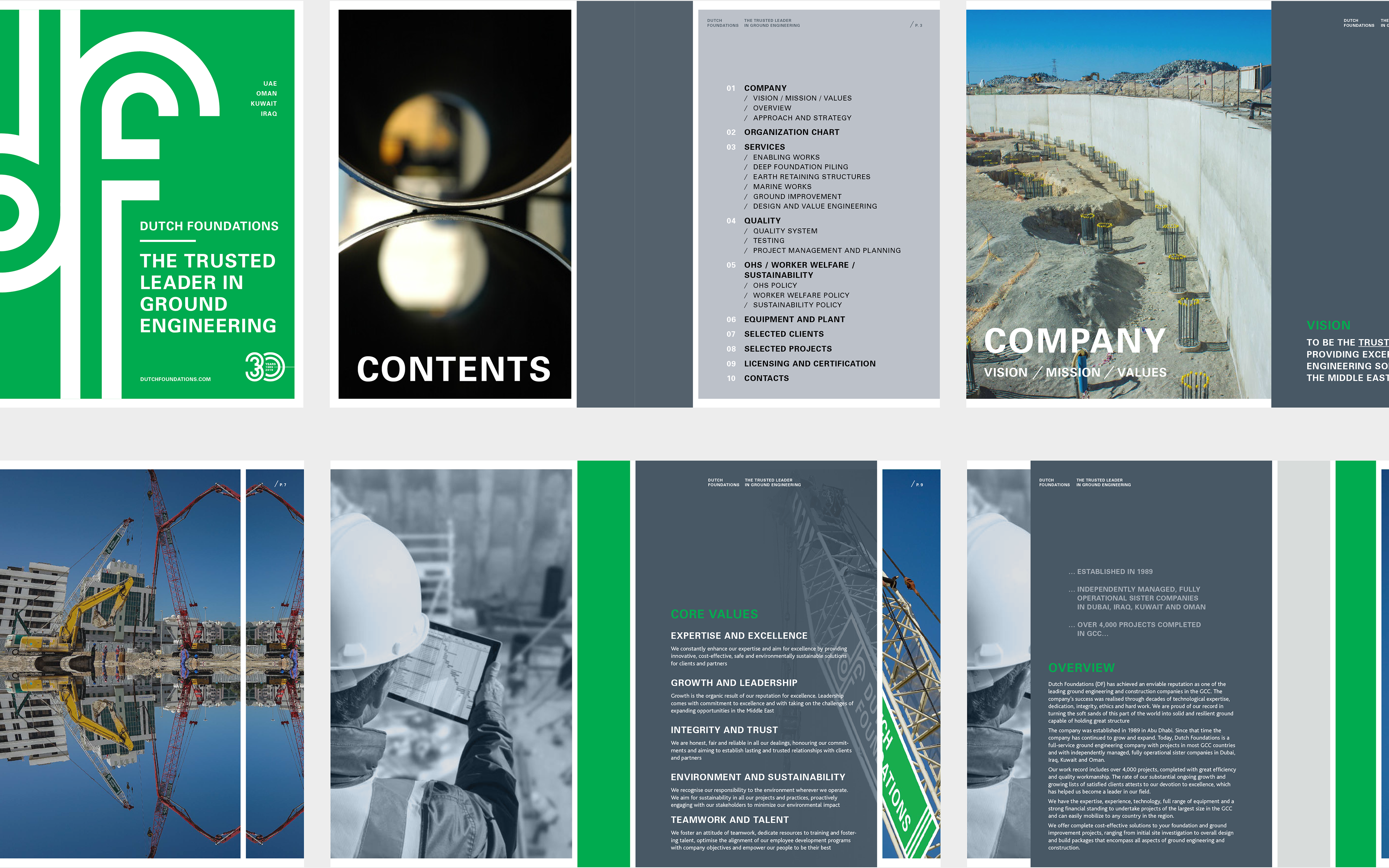
A contemporary brand identity developed for Dutch Foundations, a foundation and shoring company operating within the UAE construction sector.
The project introduces a structured and modern visual language within a traditionally conservative industry, positioning the brand with clarity and a forward-looking, sustainability-driven direction.
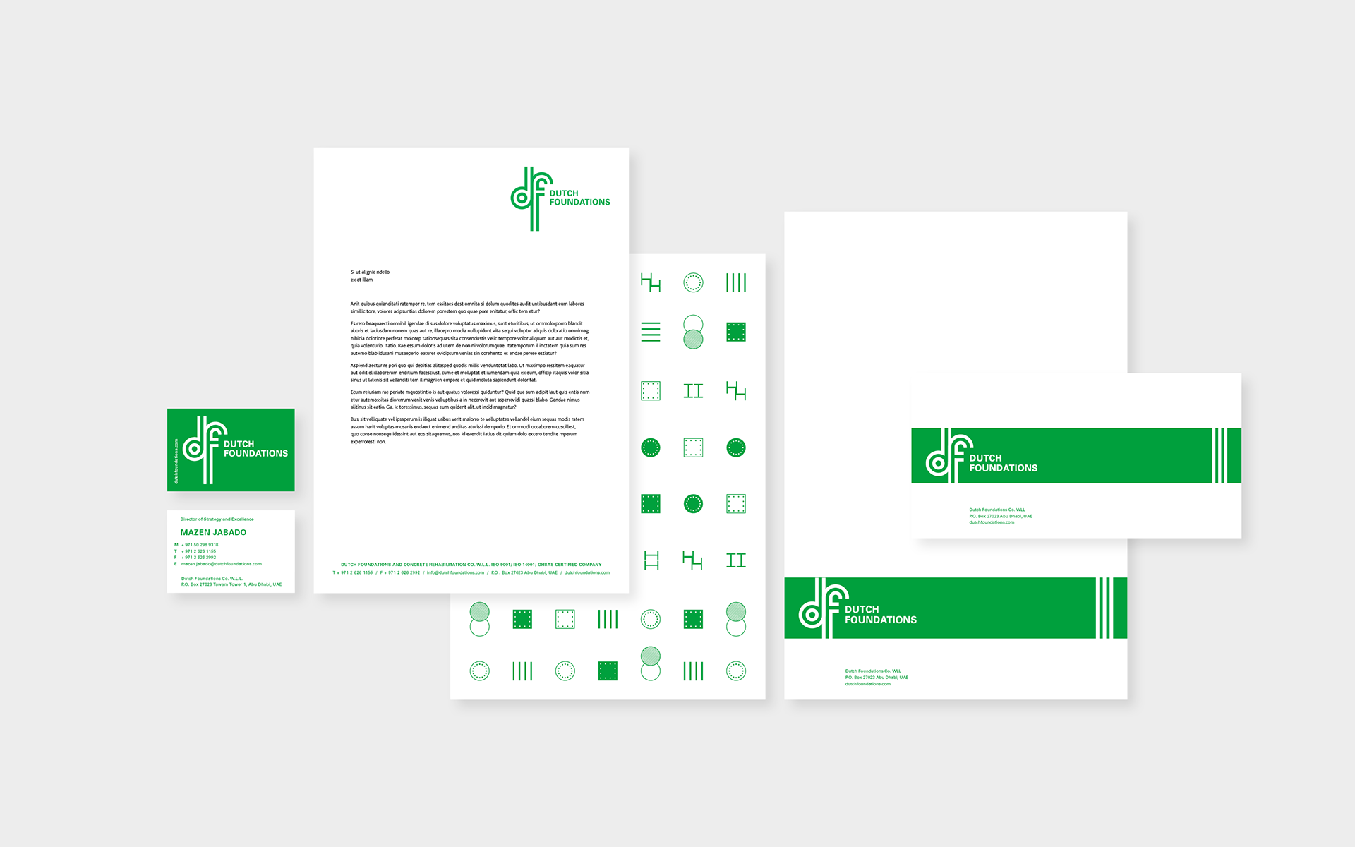
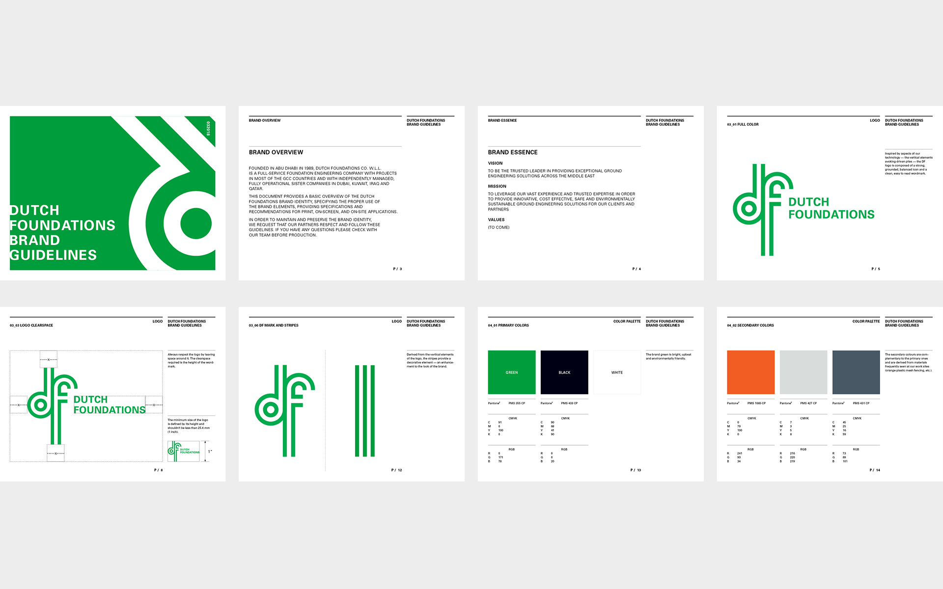
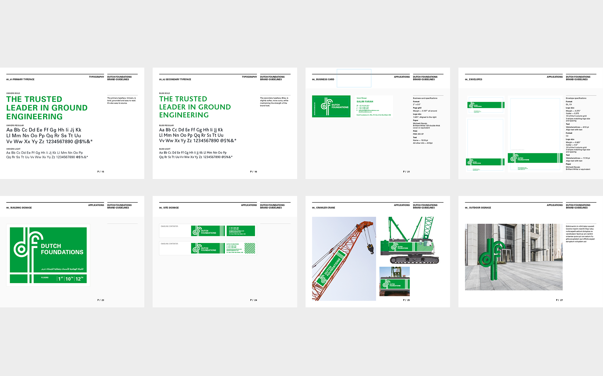
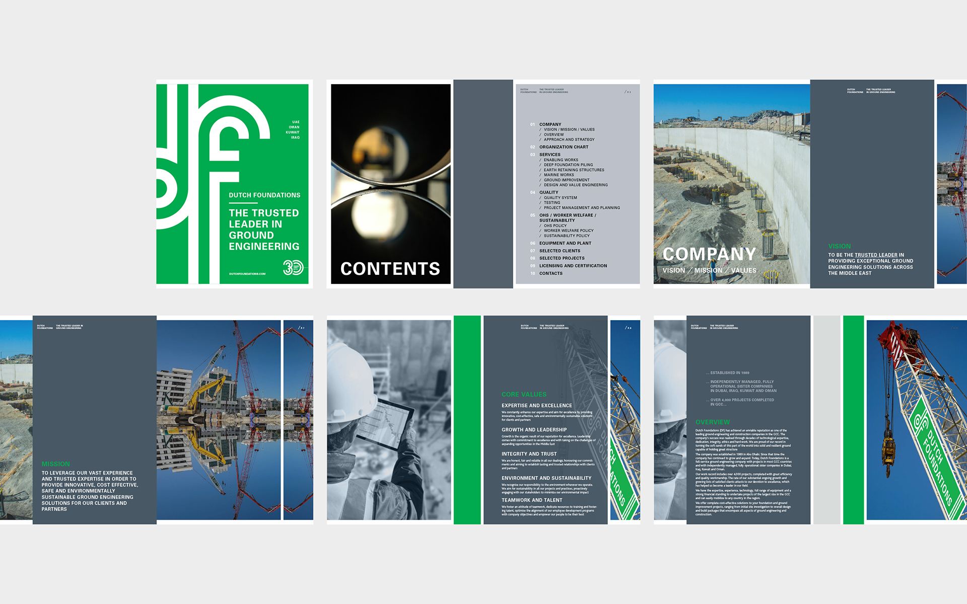
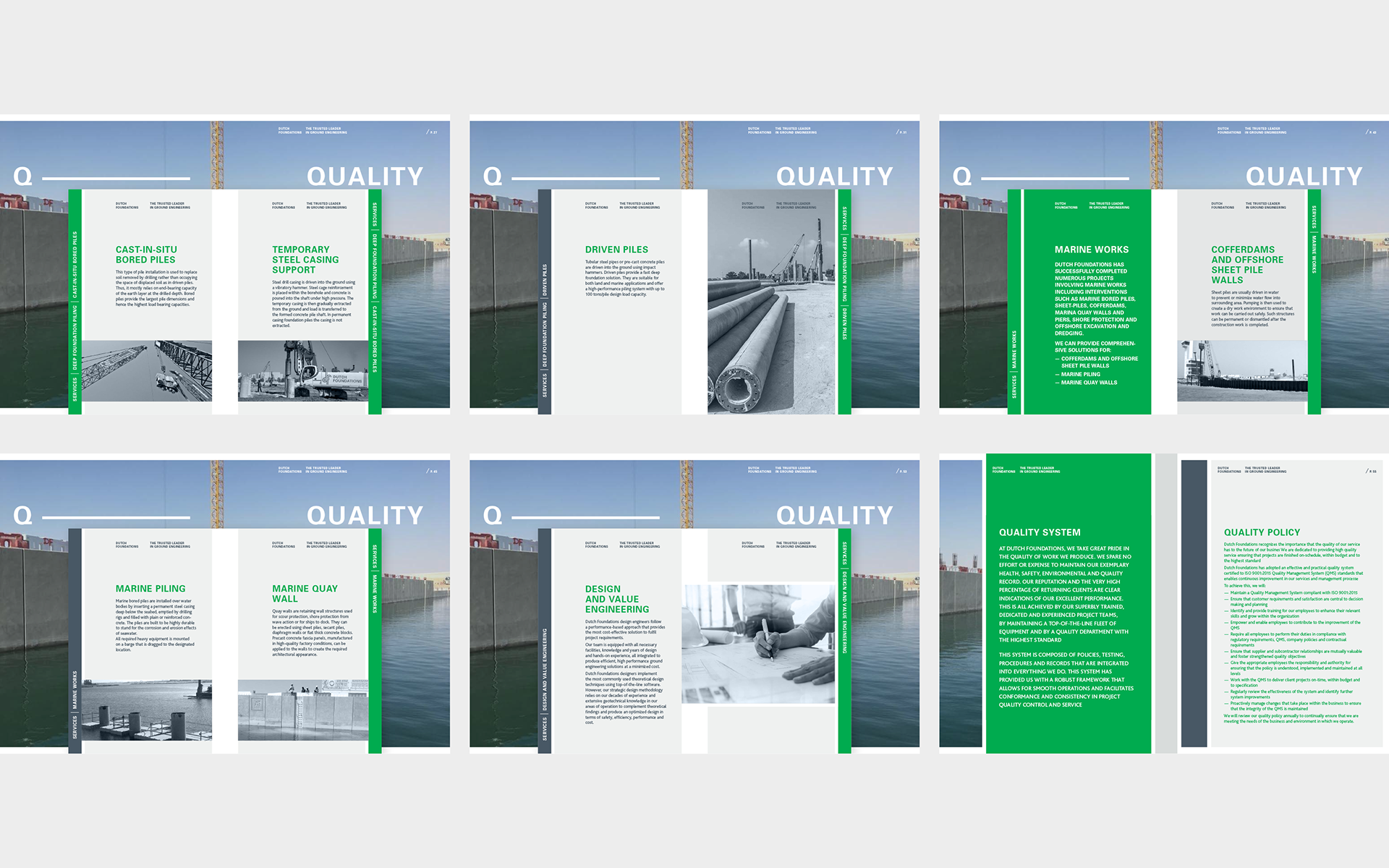
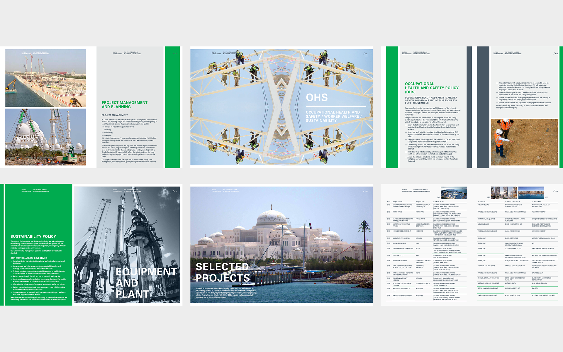
The identity is built around a restrained green and white palette, balancing environmental awareness with strength and legibility across applications.
The logo uses negative space to express the dual nature of the company’s work—operating both below and above ground—translating technical expertise into a clear visual concept.
The system extends across corporate communications, site materials, and key brand touchpoints, maintaining consistency and recognizability across demanding industrial contexts.
The result is a precise and disciplined identity that communicates reliability, performance, and long-term vision.


Concept, Design, Art Direction: Lidia Krupka
Copy: Kalman Dreisziger